TIPSY TONIC KOMBUCHA
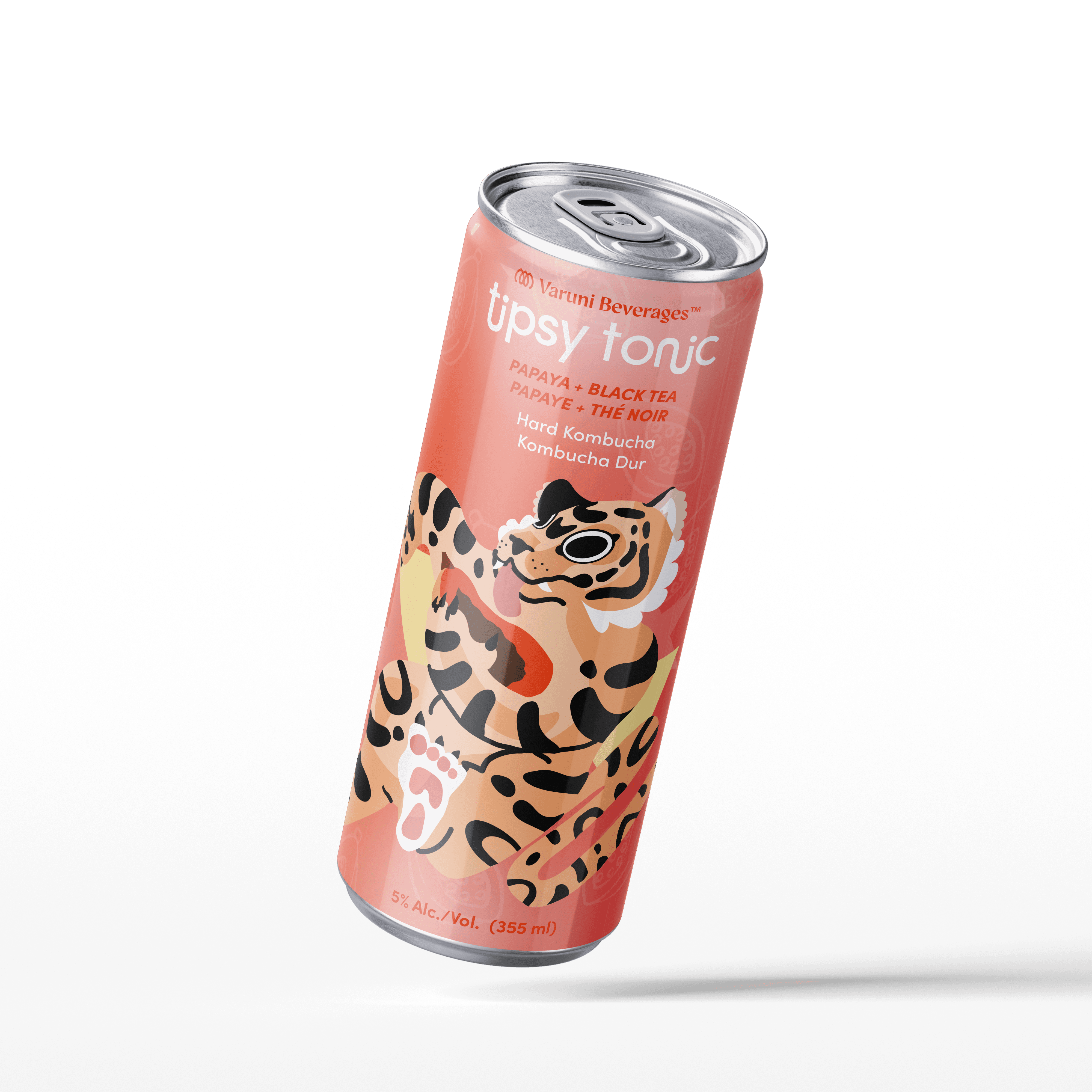
Tipsy Tonic is a hard kombucha packaging concept designed to bring playful storytelling and clean ingredients together in a crowded alcohol market. The brand balances fun and purity, using bold visuals to stand out on shelf while staying aligned with Lobo Co’s values of artisanal quality, vibrant narratives, and natural refreshment. Each can introduces a flavour as its own small story, inviting curiosity and a sense of lighthearted adventure.


The packaging system combines bright mesh gradients, playful animal illustrations, and hand drawn fruit motifs to create a cohesive yet expressive visual family. Saturated colours and wavy, energetic typography reinforce the brand’s youthful and spirited tone, while illustrated fruits add appetite appeal and vibrancy. Animal characters interact with the ingredients to introduce motion and personality, making each flavour feel alive. Visual cues also tie flavours to their regions of origin through researched symbolism, adding depth and intention to the storytelling. The design balances clarity and boldness, turning each can into a lively, sensory experience rather than just a label.


Process- original idea, sketches, refined idea, mockup example