Project Collection
click+hold to enlarge
click+hold to enlarge
click+hold to enlarge
Design an original sub-brand under the fictional parent company Varuni Beverages (or Crank Beverages), with full creative control over branding, audience, and market positioning. The goal was to craft a collection of alcoholic beverages tailored to a specific, self-defined target audience. This project explored every stage of brand development—from identifying selling points and establishing visual storytelling to creating appetite appeal through illustration, packaging motifs, and cohesive design.
Design an original sub-brand under the fictional parent company Varuni Beverages (or Crank Beverages), with full creative control over branding, audience, and market positioning. The goal was to craft a collection of alcoholic beverages tailored to a specific, self-defined target audience. This project explored every stage of brand development—from identifying selling points and establishing visual storytelling to creating appetite appeal through illustration, packaging motifs, and cohesive design.
Final packaging
Final packaging
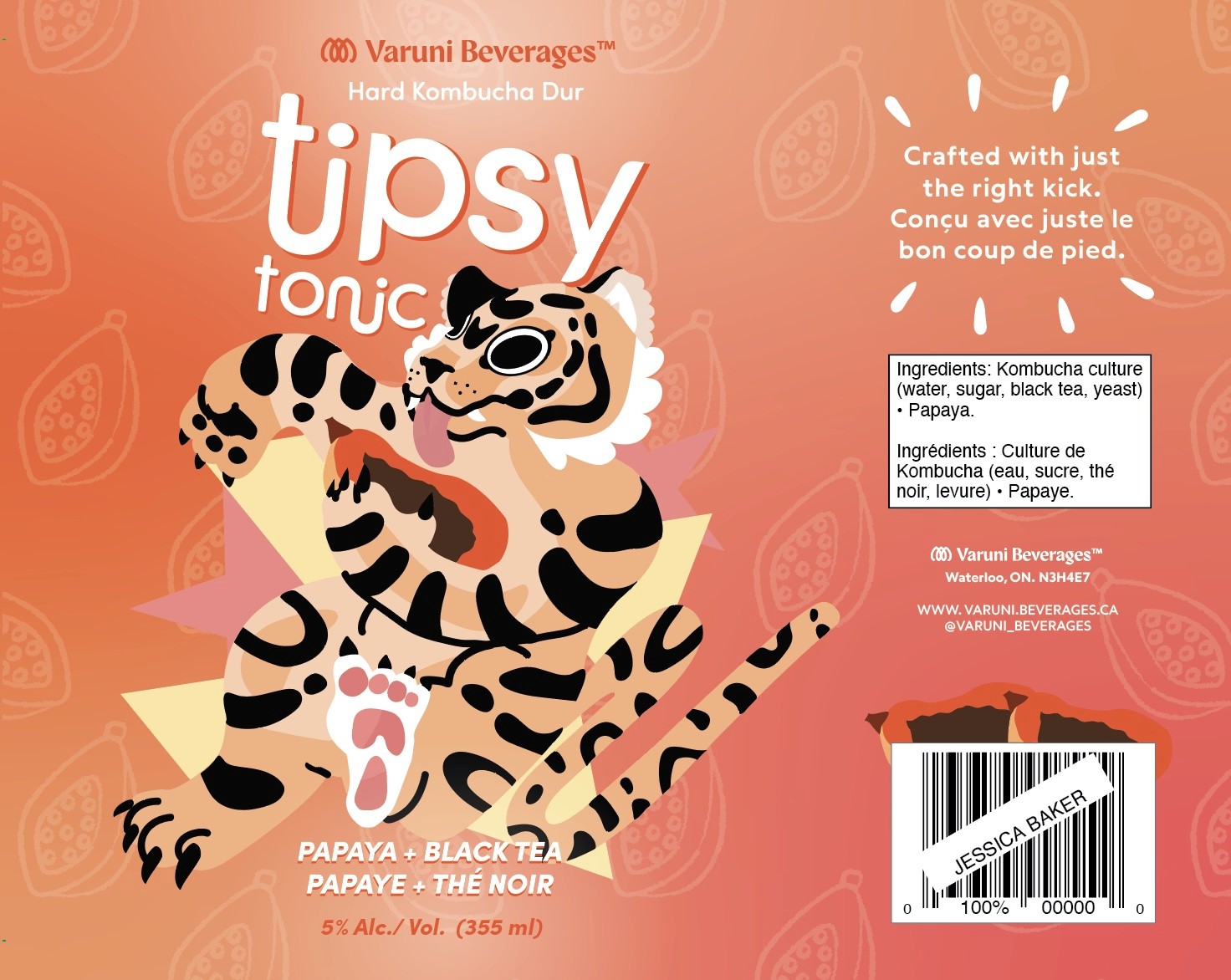
The strategic objective of the Tipsy Tonic packaging was to create a visually engaging, story driven brand identity that reflects both the playfulness and purity of the product. The goal was to stand out on shelves in a saturated alcohol market while aligning with the values of the parent brand, Varuni Beverages: artisanal quality, vibrant storytelling, and clean, natural ingredients.
To achieve this, I developed a packaging system that combines bright mesh gradients, playful tipsy animal illustrations, and fruit pattern motifs. Each can is designed to be bold and eye catching with its own unique personality while still feeling part of a cohesive visual family.
Appetite appeal was a key consideration. Each flavour features hand illustrated fruit elements that are juicy, vibrant, and visually interesting. The featured animal characters interact with these fruits; these interactions add charm and motion to the layout. The design captures the flavour driven and adventurous spirit of the drink, reinforcing the idea that Tipsy Tonic is not just a beverage but a vibrant and sensory experience.
The use of saturated, vibrant colors and wavy, energetic typography helps reinforce the brand’s youthful and spirited tone. Every design element was selected to evoke feelings of liveliness, joy, and natural refreshment.
Each flavour is visually tied to its place of origin. For example, lychee is paired with a playful lemur illustration (Ex. Lychee is Native to China, as are some Lemur species) inspired by its native region. All research was independently conducted using credible public sources to ensure cultural accuracy and intentional storytelling.
The strategic objective of the Tipsy Tonic packaging was to create a visually engaging, story driven brand identity that reflects both the playfulness and purity of the product. The goal was to stand out on shelves in a saturated alcohol market while aligning with the values of the parent brand, Varuni Beverages: artisanal quality, vibrant storytelling, and clean, natural ingredients.
To achieve this, I developed a packaging system that combines bright mesh gradients, playful tipsy animal illustrations, and fruit pattern motifs.
Design an original sub-brand under the fictional parent company Varuni Beverages (or Crank Beverages), with full creative control over branding, audience, and market positioning. The goal was to craft a collection of alcoholic beverages tailored to a specific, self-defined target audience. This project explored every stage of brand development—from identifying selling points and establishing visual storytelling to creating appetite appeal through illustration, packaging motifs, and cohesive design.
Each can is designed to be bold and eye catching with its own unique personality while still feeling part of a cohesive visual family.
Appetite appeal was a key consideration. Each flavour features hand illustrated fruit elements that are juicy, vibrant, and visually interesting. The featured animal characters interact with these fruits; these interactions add charm and motion to the layout. The design captures the flavour driven and adventurous spirit of the drink, reinforcing the idea that Tipsy Tonic is not just a beverage but a vibrant and sensory experience.
The use of saturated, vibrant colors and wavy, energetic typography helps reinforce the brand’s youthful and spirited tone. Every design element was selected to evoke feelings of liveliness, joy, and natural refreshment.
Each flavour is visually tied to its place of origin. For example, lychee is paired with a playful lemur illustration (Ex. Lychee is Native to China, as are some Lemur species) inspired by its native region. All research was independently conducted using credible public sources to ensure cultural accuracy and intentional storytelling.
Tipsy Tonic Kombucha
Creative Process
Creative Process
Tipsy Tonic
Kombucha
Objective
Objective
Objective
Very first concept was a simple kombucha company;
flat, healthy, and colourful

The name Tummy Tonic was changed to Tipsy Tonic, to reflect the alcohol content

Some elements were kept in these designs
and used for later
Tiger character sketch
Lemur character sketch
Alligator character sketch

Initial 'final designs', physically mocked up. Colours
weren't saturated. Logo wasn't a large focus, etc

Carton + cans, physical (Pre final)

Carton + cans, physical (Pre final)

Billboard mockup (pre final)
Very first concept was a simple kombucha company;
flat, healthy, and colourful
The name Tummy Tonic was changed to Tipsy Tonic, to reflect the alcohol content
Some elements were kept in these designs
and used for later
Tiger character sketch
Lemur character sketch
Alligator character sketch
Initial 'final designs', physically mocked up. Colours
weren't saturated. Logo wasn't a large focus, etc
Carton + cans, physical (Pre final)
Carton + cans, physical (Pre final)
Billboard mockup (pre final)
Rationale
Rationale
Finished Piece
Rationale
Finished Piece


Final packaging


Both physically and digitally mocked up


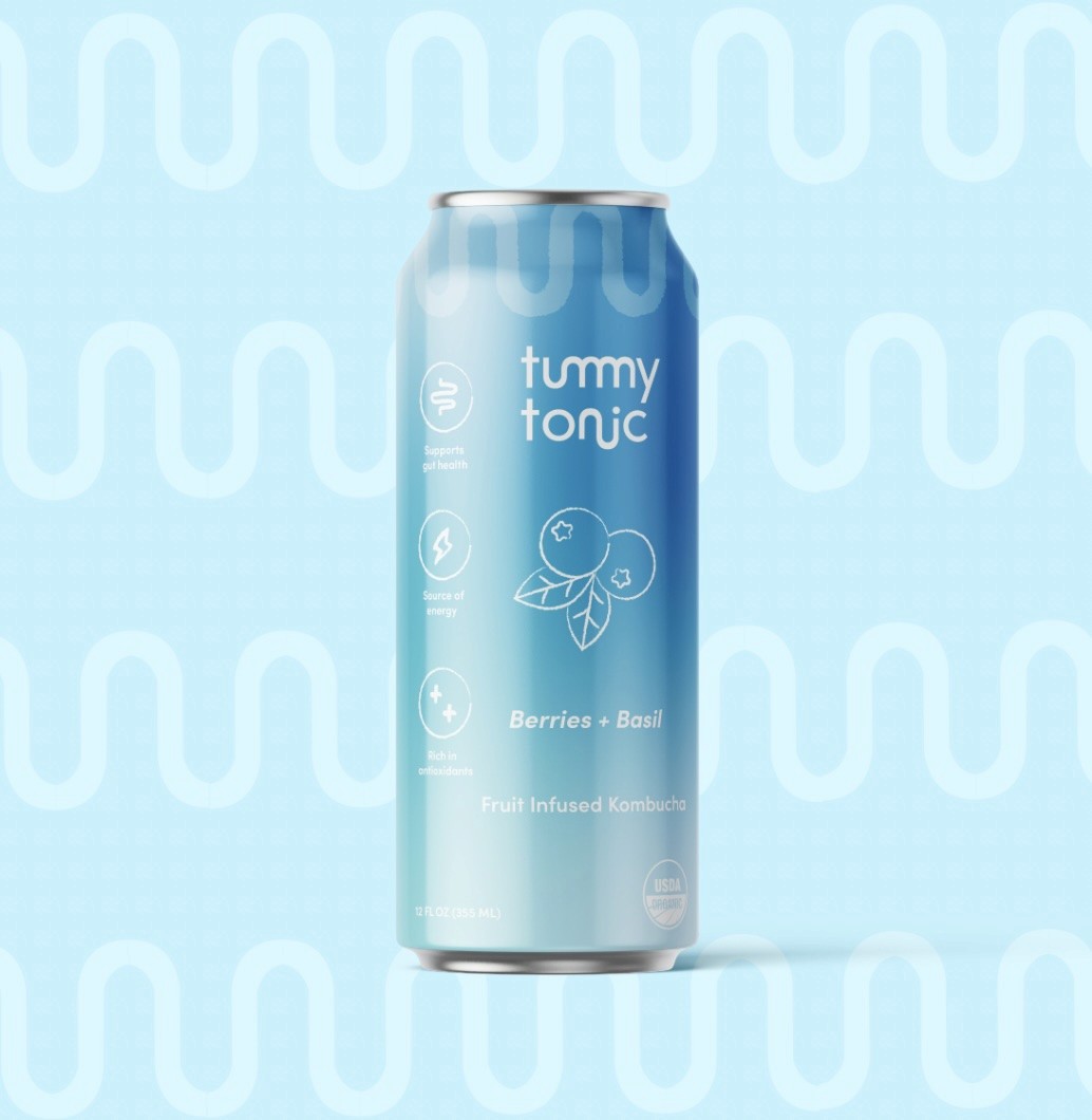
Very first concept was a simple kombucha company; flat, healthy, colourful
The name Tummy Tonic was changed to Tipsy Tonic, to reflect the alcohol content
Some elements were kept in these
designs and used for later
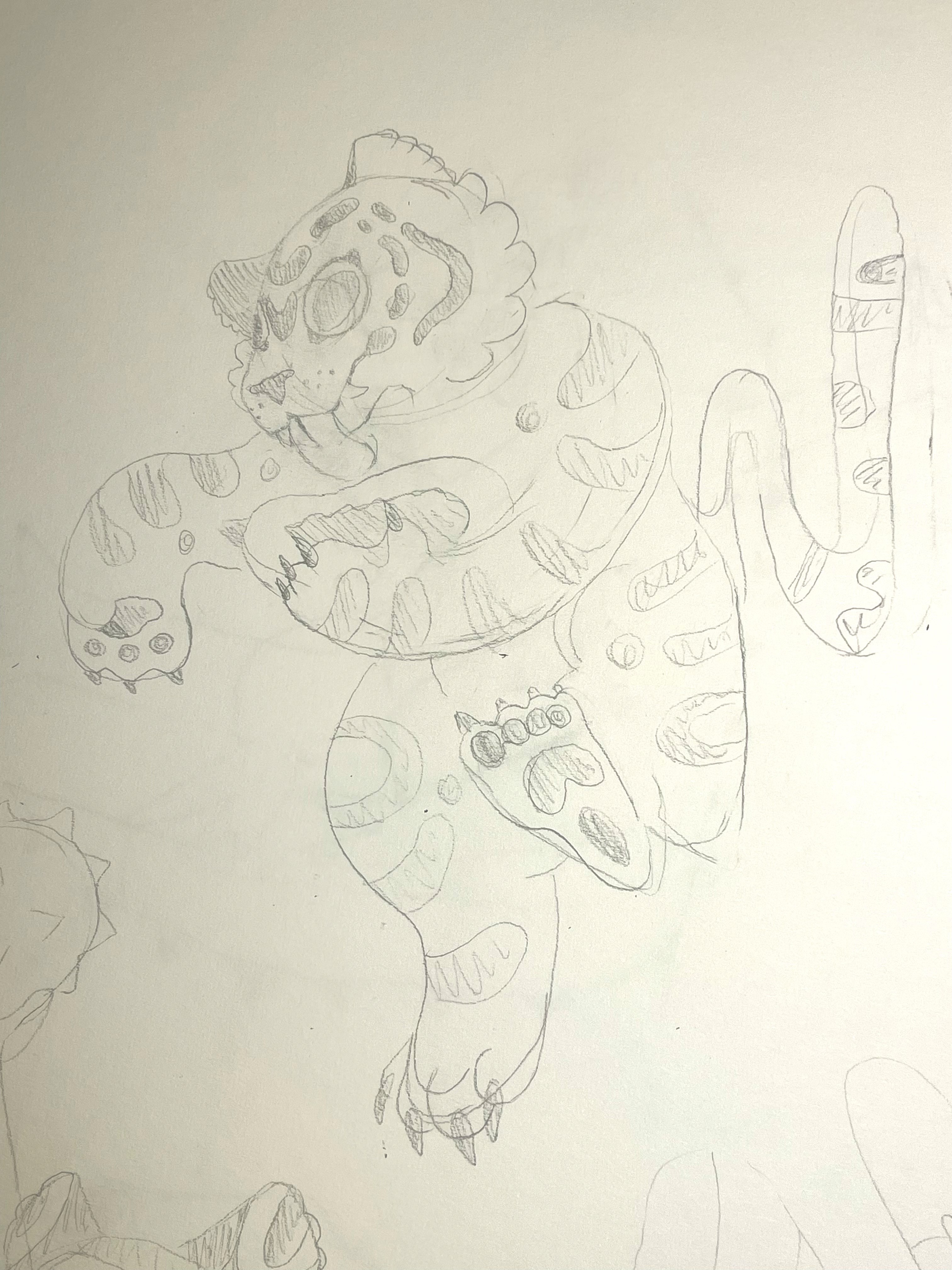
Tiger character sketch
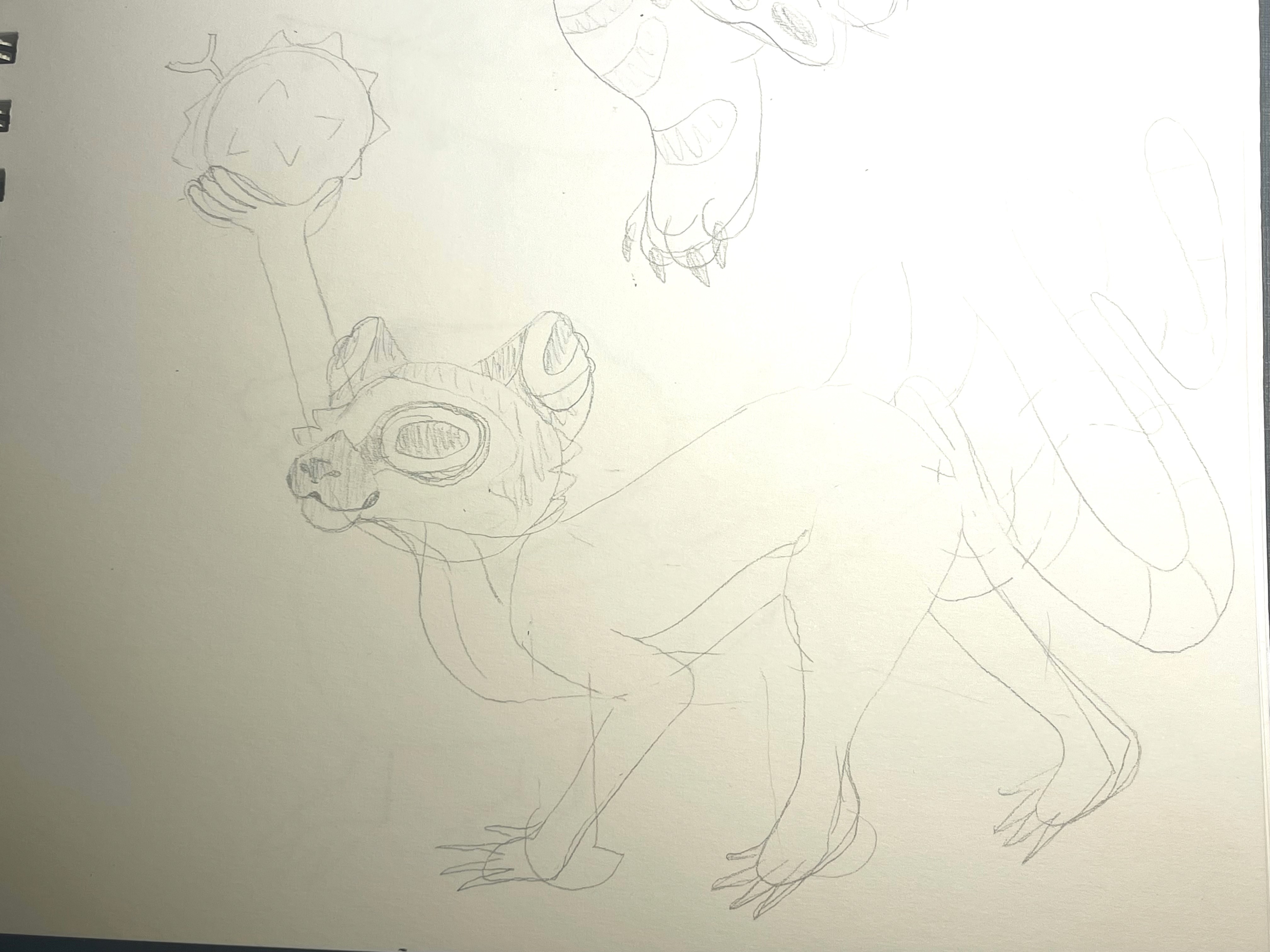
Lemur character sketch
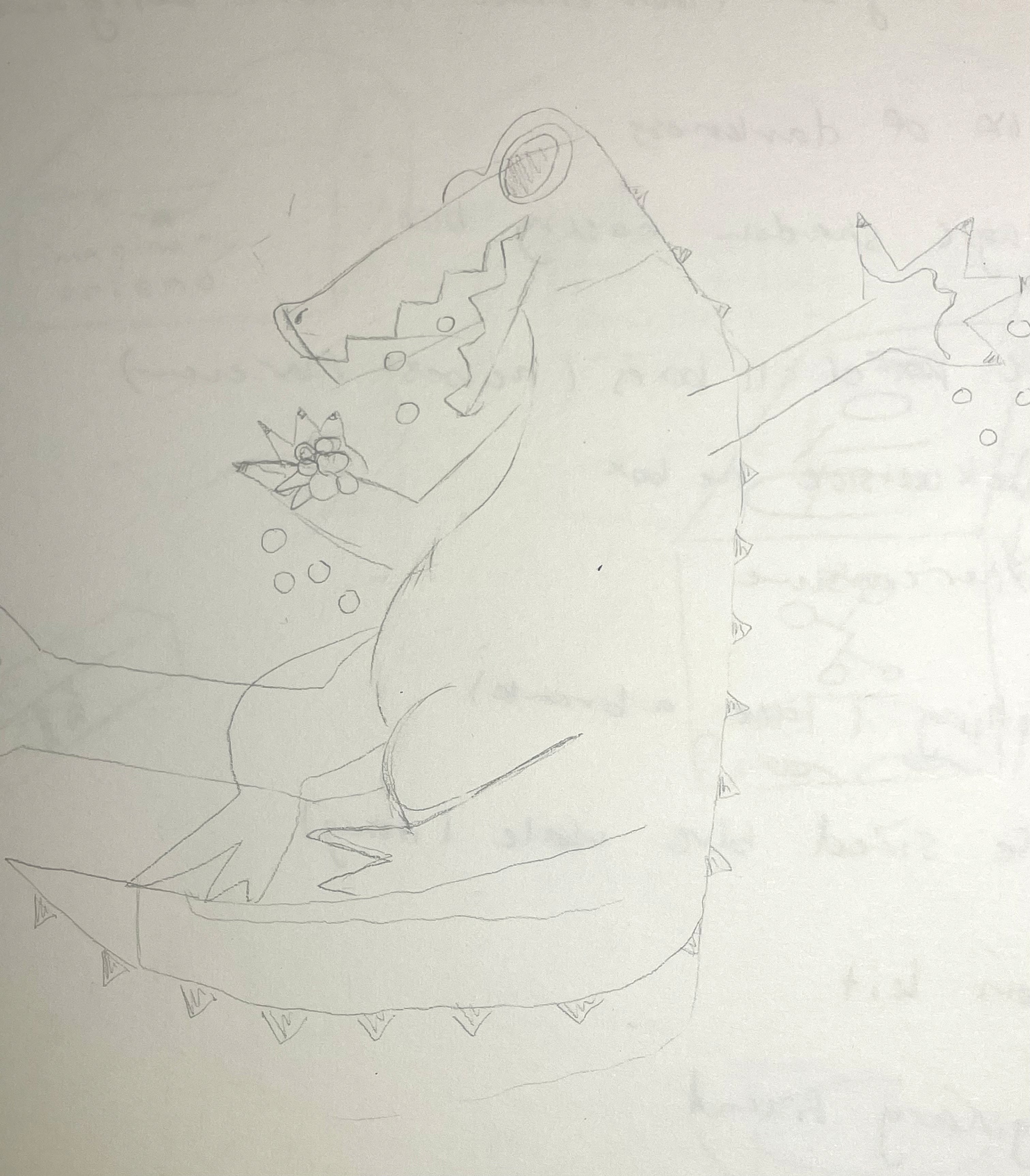
Alligator character sketch
Initial 'final designs', physically mocked up. Colours weren't saturated. Logo smaller
Carton + cans, physical (Pre final)
Carton + cans, physical (Pre final)
Billboard mockup (pre final)
Very first concept was a simple kombucha company; flat, healthy, colourful
The name Tummy Tonic was changed to Tipsy Tonic, to reflect the alcohol content
Some elements were kept in these
designs and used for later
Tiger character sketch
Lemur character sketch
Alligator character sketch
Initial 'final designs', physically mocked up. Colours weren't saturated. Logo smaller
Carton + cans, physical (Pre final)
Carton + cans, physical (Pre final)
Billboard mockup (pre final)