


Project Collection
click+hold to enlarge
click+hold to enlarge
The ask was to create a recipe pairing book (to pair the recipes with a theme). There are three main components to creating a pairing book; photography, photo editing, and layout/editorial design.
The ask was to create a recipe pairing book (to pair the recipes with a theme). There are three main components to creating a pairing book; photography, photo editing, and layout/editorial design.
Final booklet
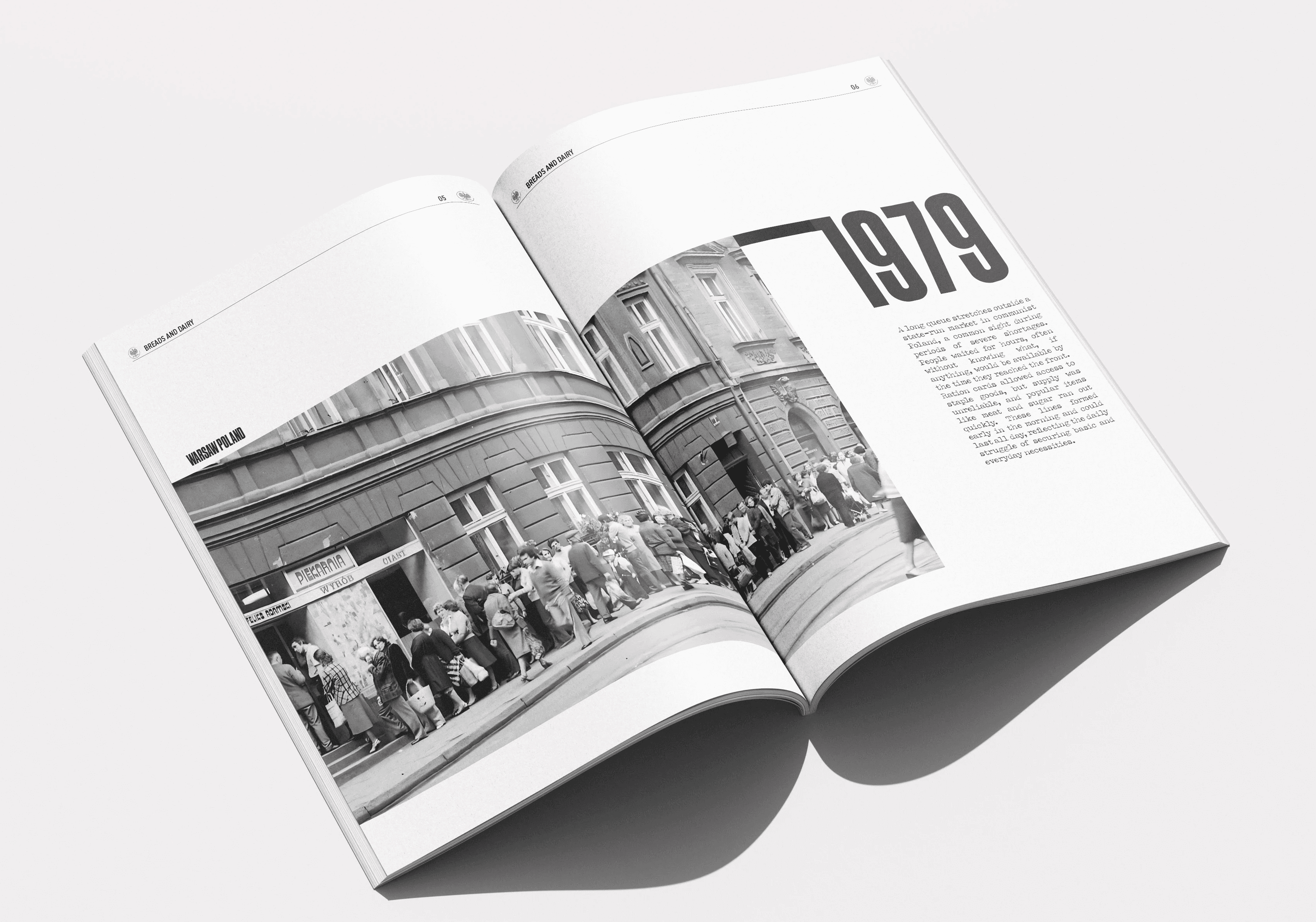
More than just a recipe collection, this book is a deeply immersive experience; designed to look and feel like a food themed newspaper straight out of 1970s Communist Poland. From the typography to the colour palette and material choices, every detail evokes the aesthetic of the era; a time when ingredients were scarce, and resourcefulness was essential.
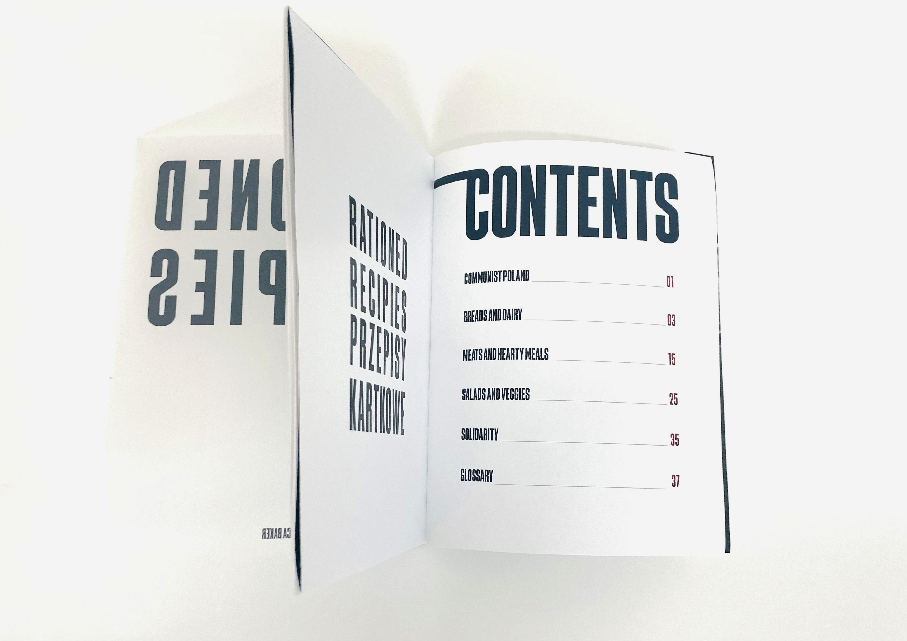
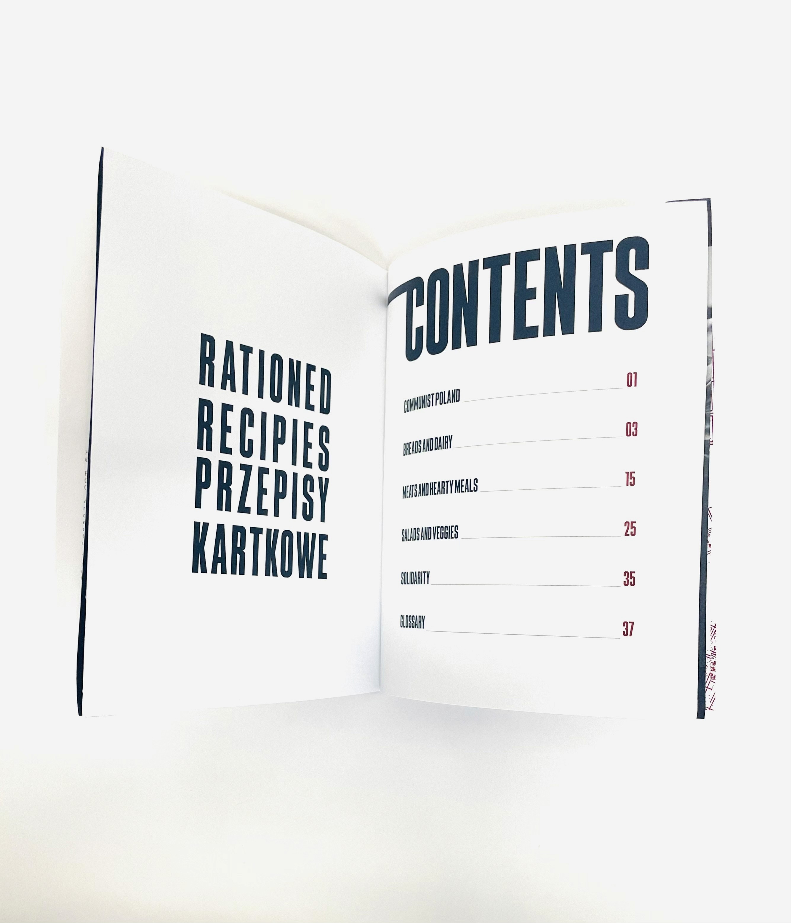
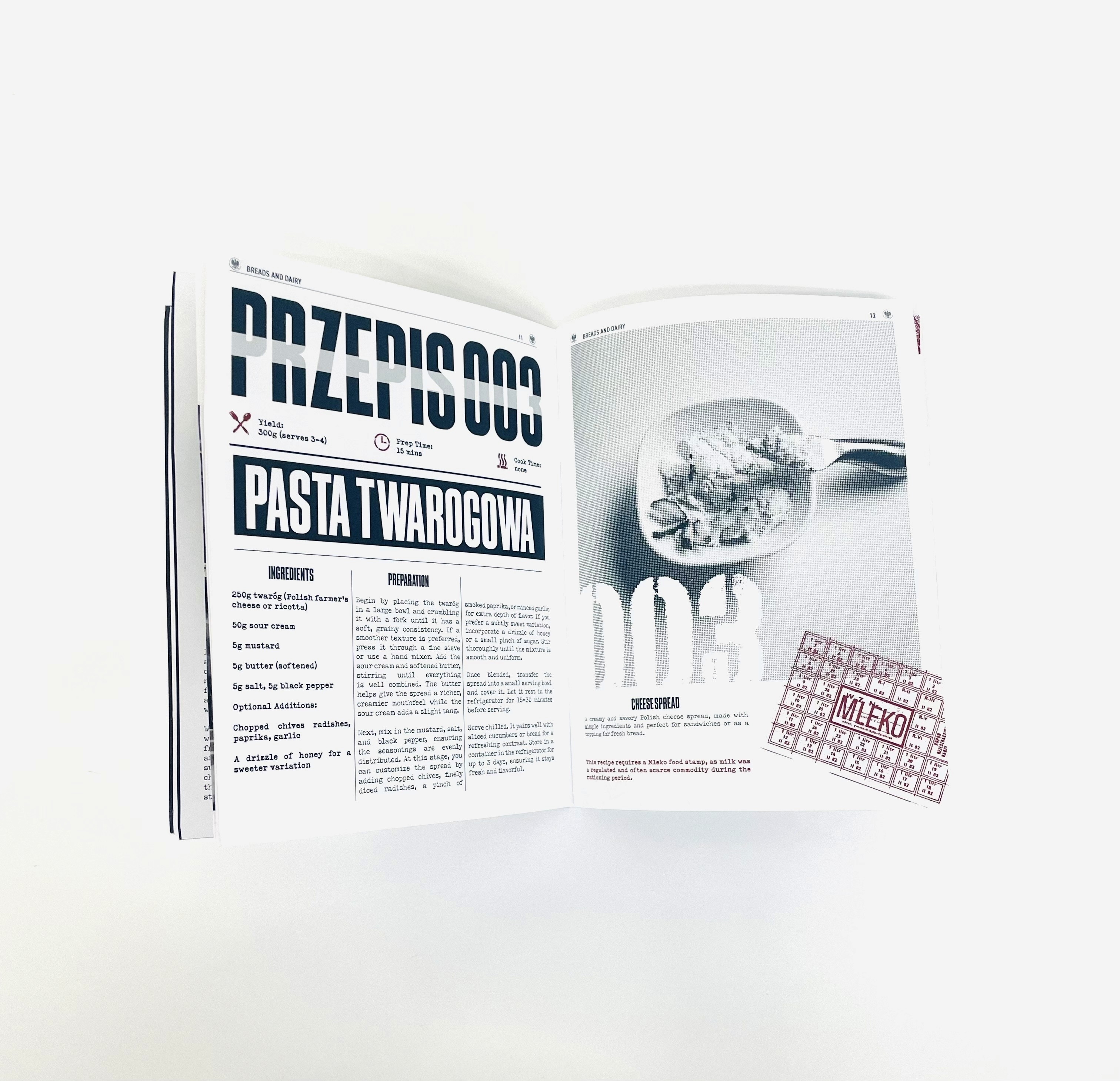
Each of the ten spreads presents a traditional Polish dish, designed with a balance of historical accuracy and a brutalist style. This project highlights the resilience and creativity that defined Polish cooking under strict conditions. Beyond food, the book documents the progression of communism in Poland; from the immediate aftermath of World War II to the political transformations of the late 1980s. It’s divided into three main sections: an introduction (including chapter intros and prefaces), the recipes themselves, and a conclusion with a glossary.
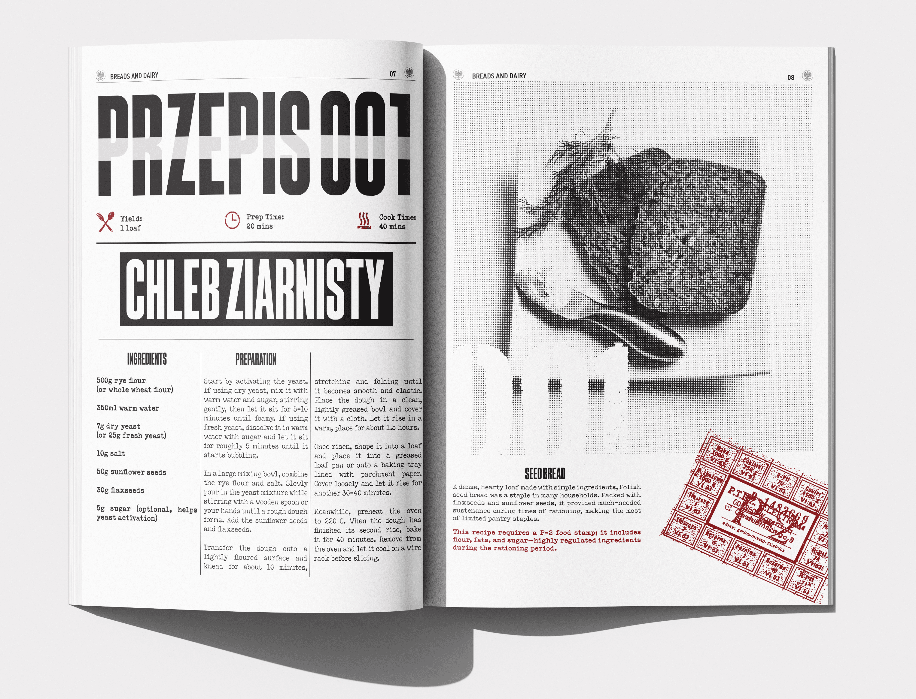
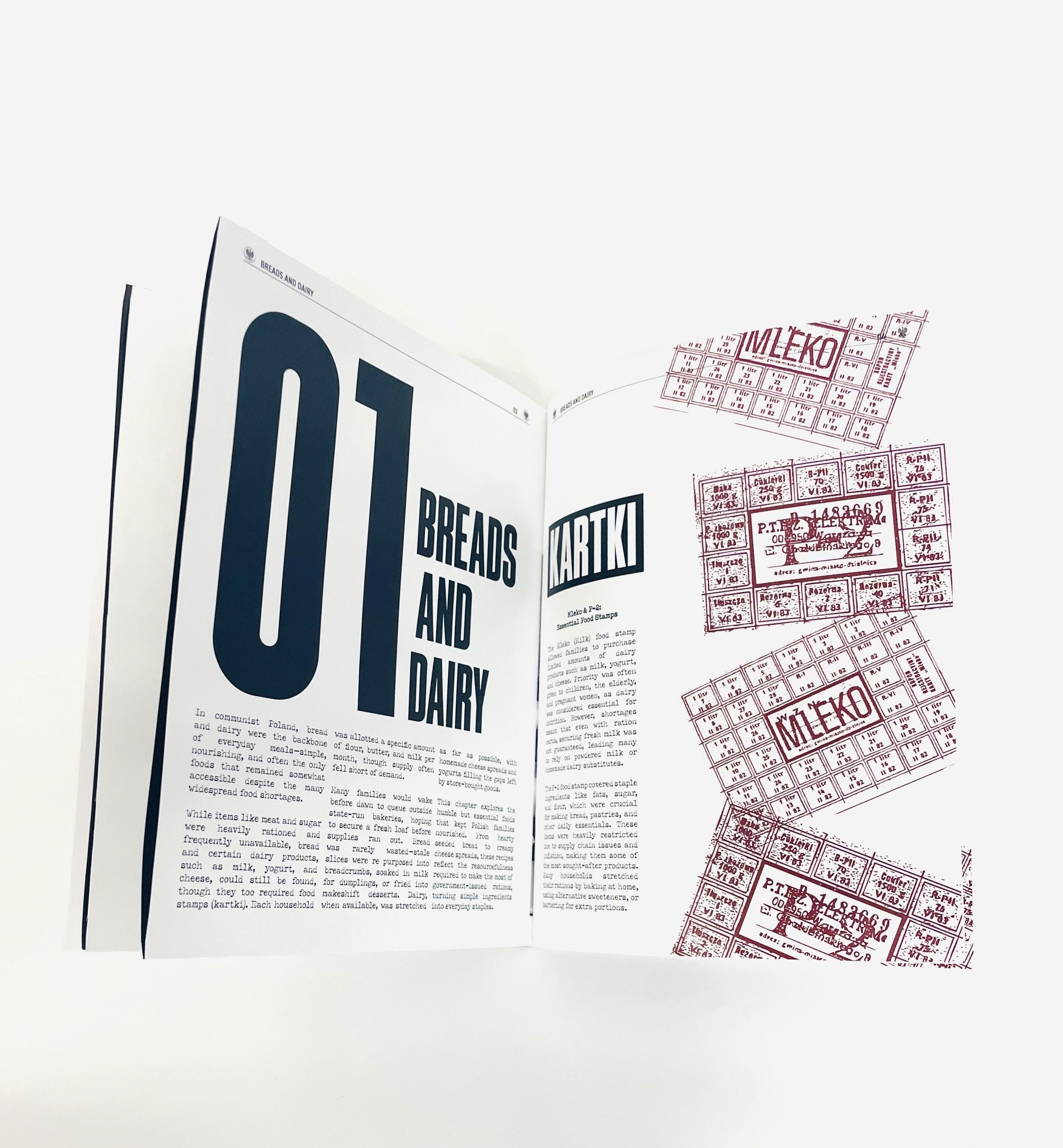
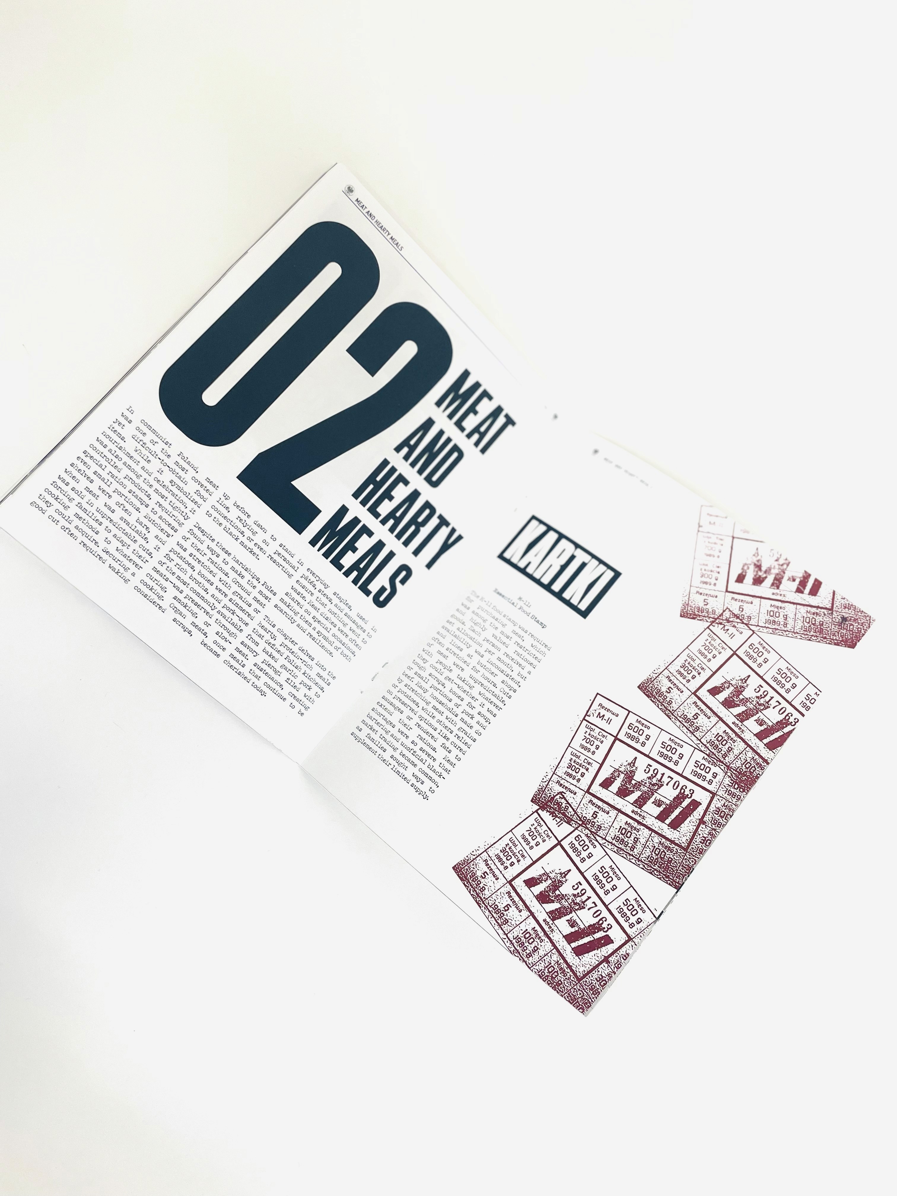
At the heart of the book lies the concept of Kartki: Polish ration cards used during the communist era. These cards dictated what families could eat, when, and how much. The structure of the book follows this concept, with each chapter themed around a specific Kartka and the limitations it imposed. This thematic division not only organizes the recipes but also illustrates the evolving nature of rationing and scarcity over time.
In terms of chapter division, it reads as followed; breads and dairy (P-2 food stamp), meat and hearty meals (M-11 food stamp), salads and veggies (domestic and unregulated product). The book takes the reader through the history of communism in Poland. Notably, the Solidarity movement.
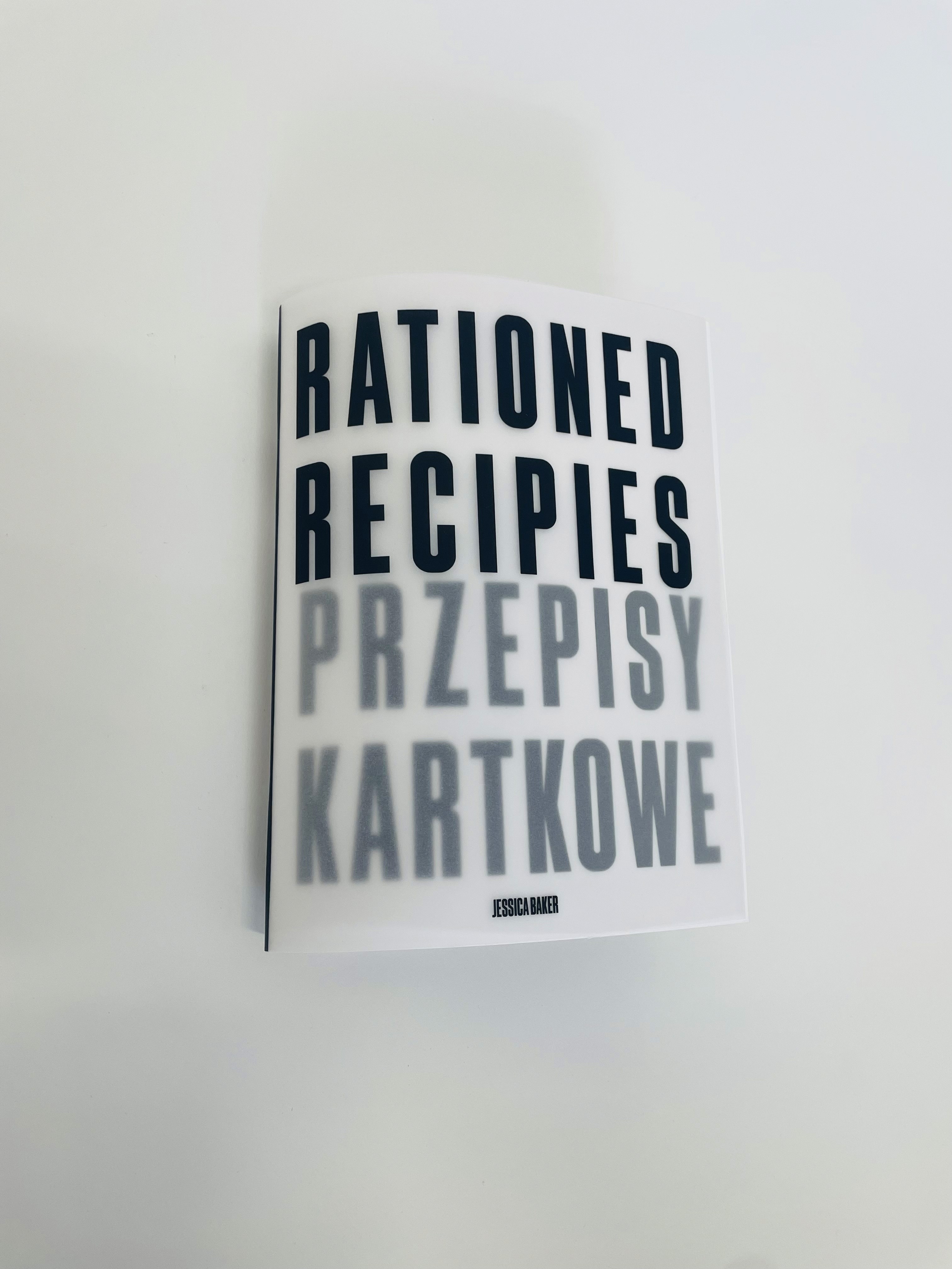
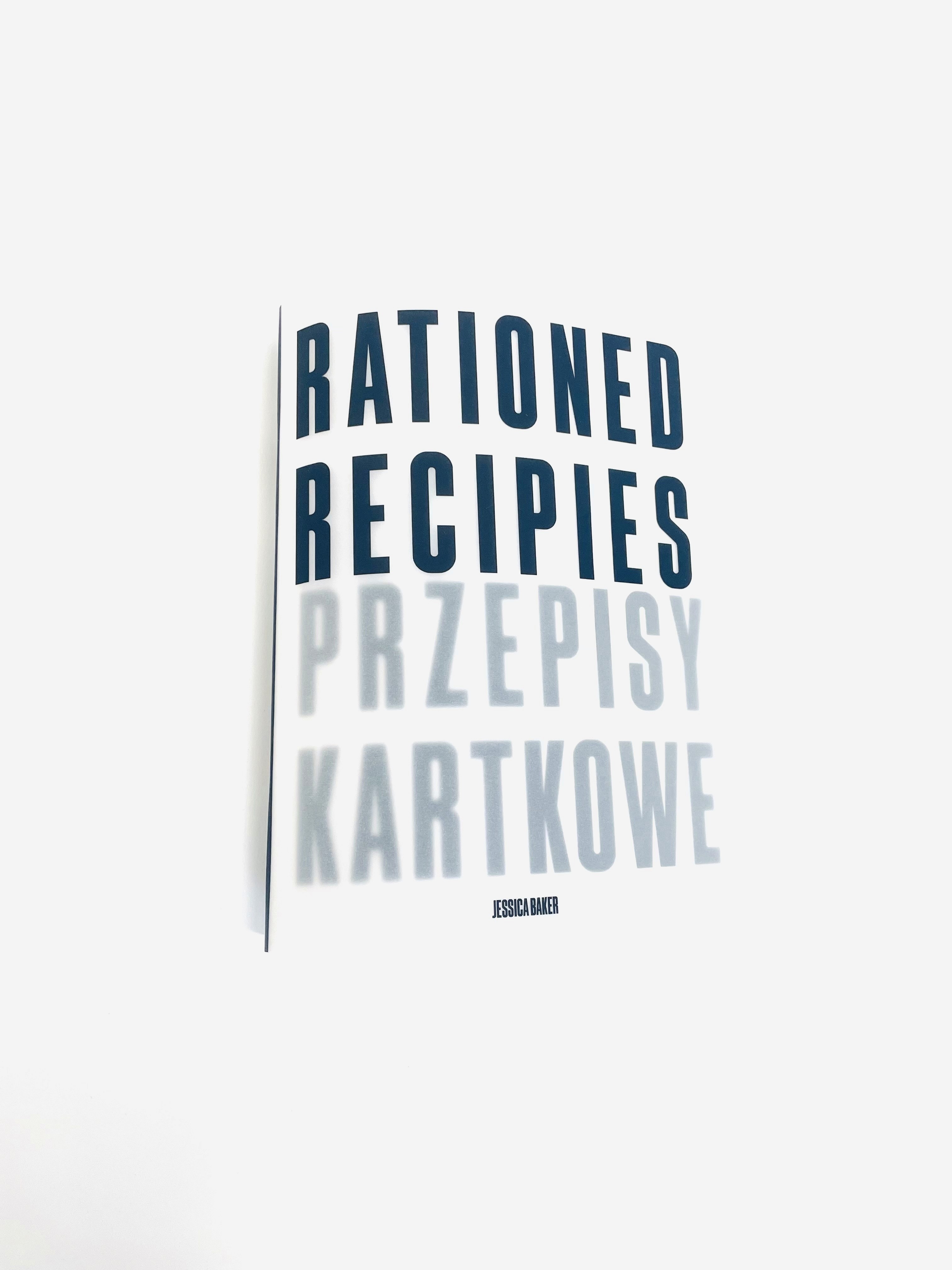
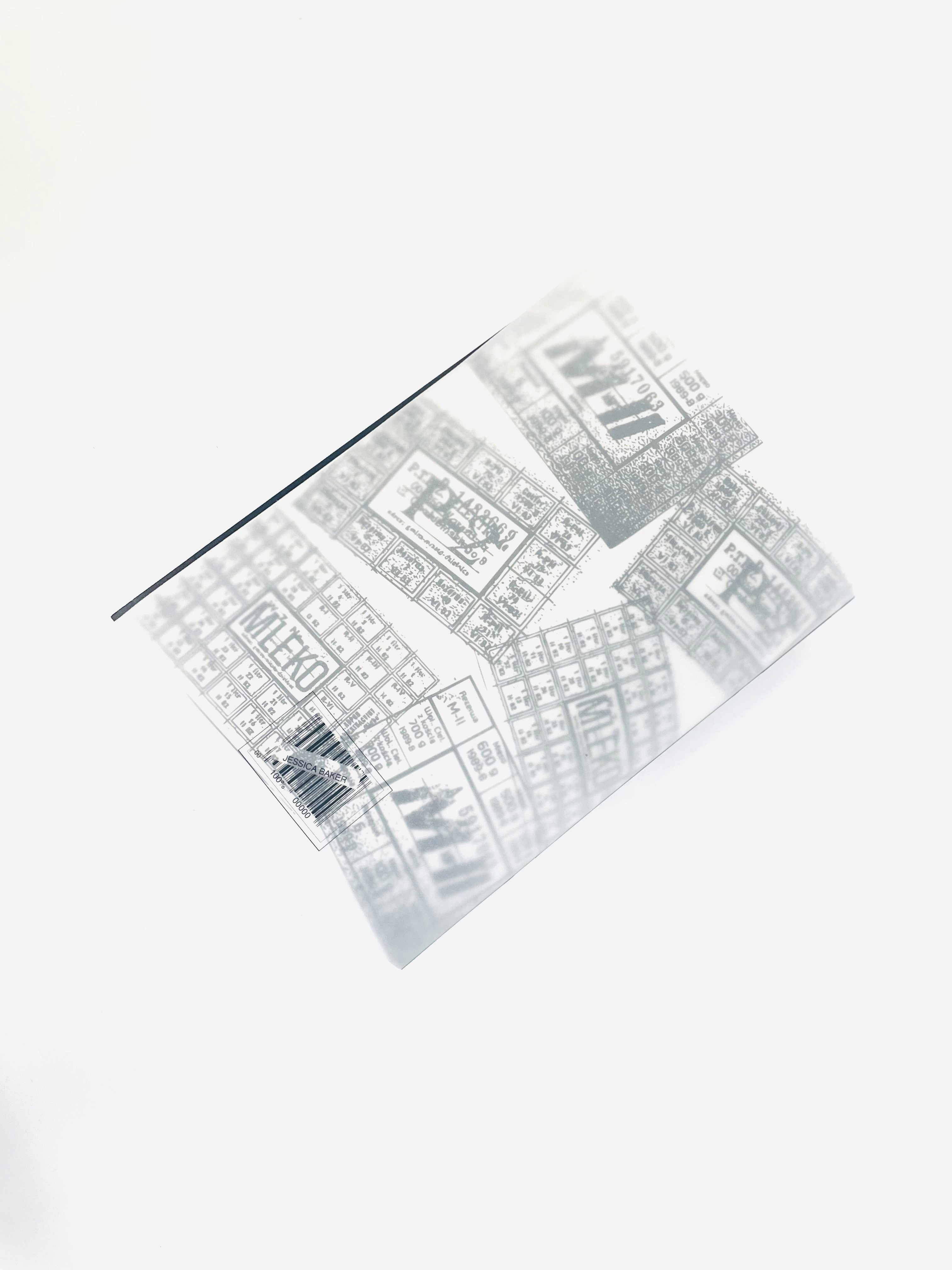
The design of this book is entirely black and white, with the only pops of colour being the stamps, and some numbers. The physical book is made with translucent velum paper, giving the cover a see through effect, with the polish translation peeking through the paper.
More than just a recipe collection, this book is a deeply immersive experience; designed to look and feel like a food themed newspaper straight out of 1970s Communist Poland. From the typography to the colour palette and material choices, every detail evokes the aesthetic of the era; a time when ingredients were scarce, and resourcefulness was essential.
Each of the ten spreads presents a traditional Polish dish, designed with a balance of historical accuracy and a brutalist style. This project highlights the resilience and creativity that defined Polish cooking under strict conditions. Beyond food, the book documents the progression of communism in Poland; from the immediate aftermath of World War II to the political transformations of the late 1980s. It’s divided into three main sections: an introduction (including chapter intros and prefaces), the recipes themselves, and a conclusion with a glossary.
At the heart of the book lies the concept of Kartki: Polish ration cards used during the communist era. These cards dictated what families could eat, when, and how much. The structure of the book follows this concept, with each chapter themed around a specific Kartka and the limitations it imposed. This thematic division not only organizes the recipes but also illustrates the evolving nature of rationing and scarcity over time.
In terms of chapter division, it reads as followed; breads and dairy (P-2 food stamp), meat and hearty meals (M-11 food stamp), salads and veggies (domestic and unregulated product). The book takes the reader through the history of communism in Poland. Notably, the Solidarity movement.
The design of this book is entirely black and white, with the only pops of colour being the stamps, and some numbers. The physical book is made with translucent velum paper, giving the cover a see through effect, with the polish translation peeking through the paper.
More than just a recipe collection, this book is a deeply immersive experience—designed to look and feel like a food-themed newspaper straight out of 1970s Communist Poland. From the typography to the color palette and material choices, every detail evokes the aesthetic of the era. The pages feel as if they’ve been pulled from a time when ingredients were scarce, and resourcefulness was essential.
Each of the ten spreads presents a traditional Polish dish, designed with a balance of historical accuracy and modern brutalist sensibilities. By stripping the visuals down to their rawest form, this project highlights the resilience and creativity that defined Polish cooking under strict conditions.
The ask was to create a recipe pairing book (to pair the recipes with a theme). This cookbook is a brutalist exploration of Polish cuisine, inspired by the design and aesthetics of 1970s communist Poland. I used bold, utilitarian typography, stark layouts, and black/white halftone food photography, the book reflects the era’s rationing system, food scarcity, and resourcefulness. Chapter breaks incorporate scanned ration cards, government-issued food regulations, and references to the culinary limitations of the time. It is a historical and educational piece, pairing Polish food with its history in a relevant way.
Beyond food, the book documents the progression of communism in Poland—from the immediate aftermath of World War II to the political transformations of the late 1980s. It’s divided into three main sections: an introduction (including chapter intros and prefaces), the recipes themselves, and a conclusion with a glossary. At the heart of the book lies the concept of Kartki—Polish ration cards used during the communist era. These cards dictated what families could eat, when, and how much. The structure of the book follows this concept, with each chapter themed around a specific Kartka and the limitations it imposed. This thematic division not only organizes the recipes but also illustrates the evolving nature of rationing and scarcity over time.
In terms of chapter division, it reads as followed; breads and dairy (P-2 food stamp), meat and hearty meals (M-11 food stamp), salads and veggies (domestic and unregulated product). The book takes the reader through the history of communism in Poland. Notably, the Solidarity movement. The book mimics Polish newspaper styles of the 1970s. All black and white, with the only pops of colour being the stamps, and some numbers. The physical book is made with translucent velum paper, giving the cover a see through effect, with the polish translation peeking through the paper.
Rationed Recipes Cookbook
Rationed Recipes
Cookbook
Creative Process
Creative Process
Rationed Recipes
Cookbook
Objective
Objective
Objective
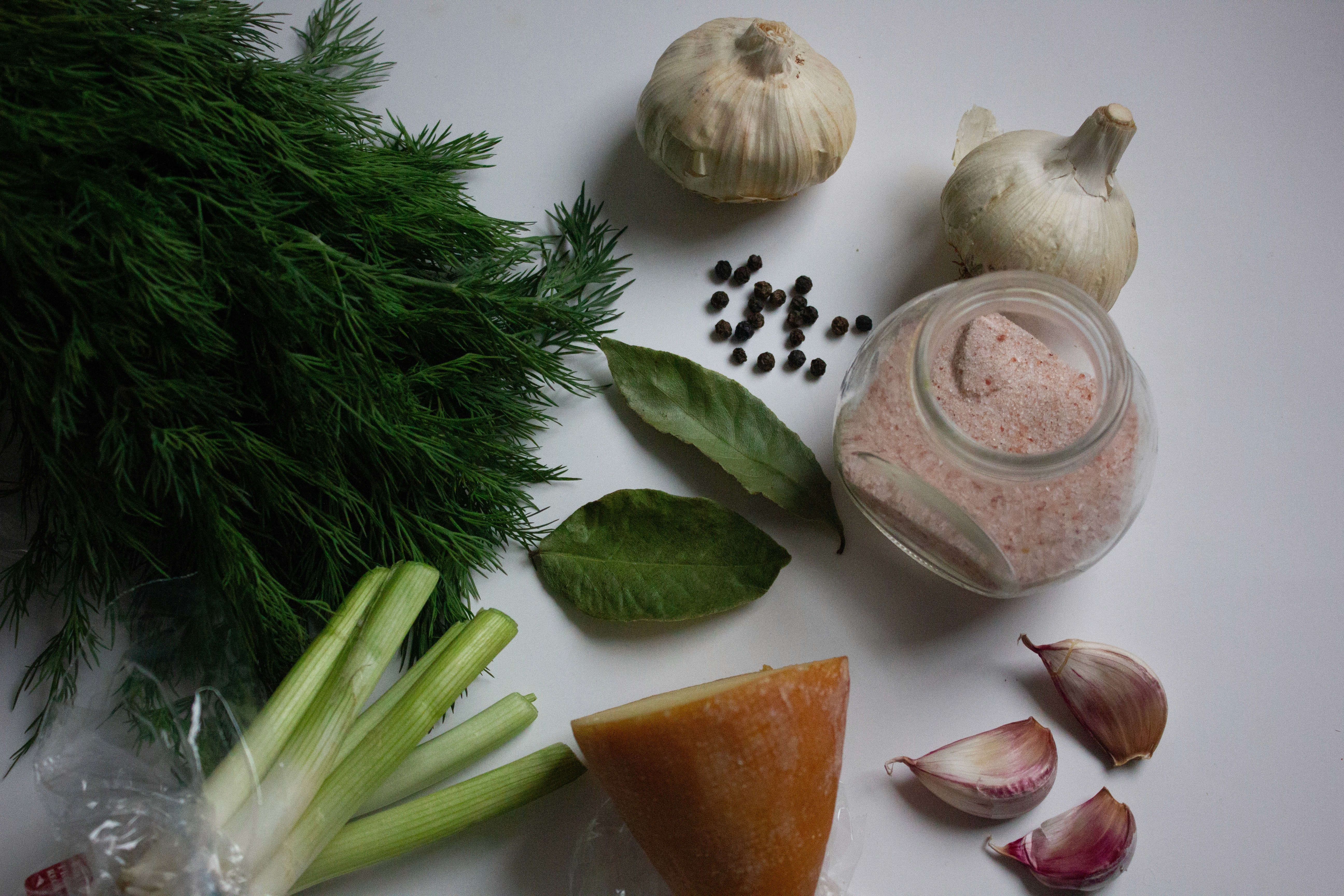
Process of photo editing: the raw photo

Crop, touchups, greyscale

Half tone effect
The original concept

Kartki (ration cards) reference
Final print; velum cover

Newspaper from 70s Poland reference
Process of photo editing: the raw photo
Crop, touchups, greyscale
Half tone effect
The original concept
Kartki (ration cards) reference
Final print; velum cover
Newspaper from 70s Poland reference
Process of photo editing: the raw photo
Crop, touchups, greyscale
Half tone effect
The original concept
Kartki (ration cards) reference
Final print; velum cover
Newspaper from 70s Poland reference
Process of photo editing: the raw photo
Crop, touchups, greyscale
Half tone effect
The original concept
Kartki (ration cards) reference
Final print; velum cover
Newspaper from 70s Poland reference
Rationale
Finished Piece
Rationale
Finished Piece


Final booklet
Process of photo editing: the raw photo
Crop, touchups, greyscale
Half tone effect
The original concept
Kartki (ration cards) reference
Final print; velum cover
Newspaper from 70s Poland reference
Process of photo editing: the raw photo
Crop, touchups, greyscale
Half tone effect
The original concept
Kartki (ration cards) reference
Final print; velum cover
Newspaper from 70s Poland reference
Process of photo editing: the raw photo
Crop, touchups, greyscale
Half tone effect
The original concept
Kartki (ration cards) reference
Final print; velum cover
Newspaper from 70s Poland reference
Process of photo editing: the raw photo
Crop, touchups, greyscale
Half tone effect
The original concept
Kartki (ration cards) reference
Final print; velum cover
Newspaper from 70s Poland reference
Digital mockups
Physical mockups


Rationale
click+hold to enlarge
Final design
Finished Piece
Digital mockups