

Project Collection
click+hold to enlarge
click+hold to enlarge
Design a jam brand from the ground up, including the product concept, logo, brand name, flavour, and full packaging system. This includes not only visual branding but also the conceptual rationale, material choices, and how the product would be positioned in a competitive market.
Design a jam brand from the ground up, including the product concept, logo, brand name, flavour, and full packaging system. This includes not only visual branding but also the conceptual rationale, material choices, and how the product would be positioned in a competitive market.
Final jam packaging
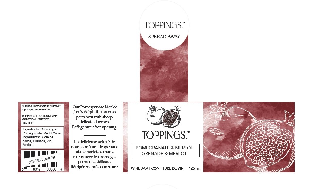
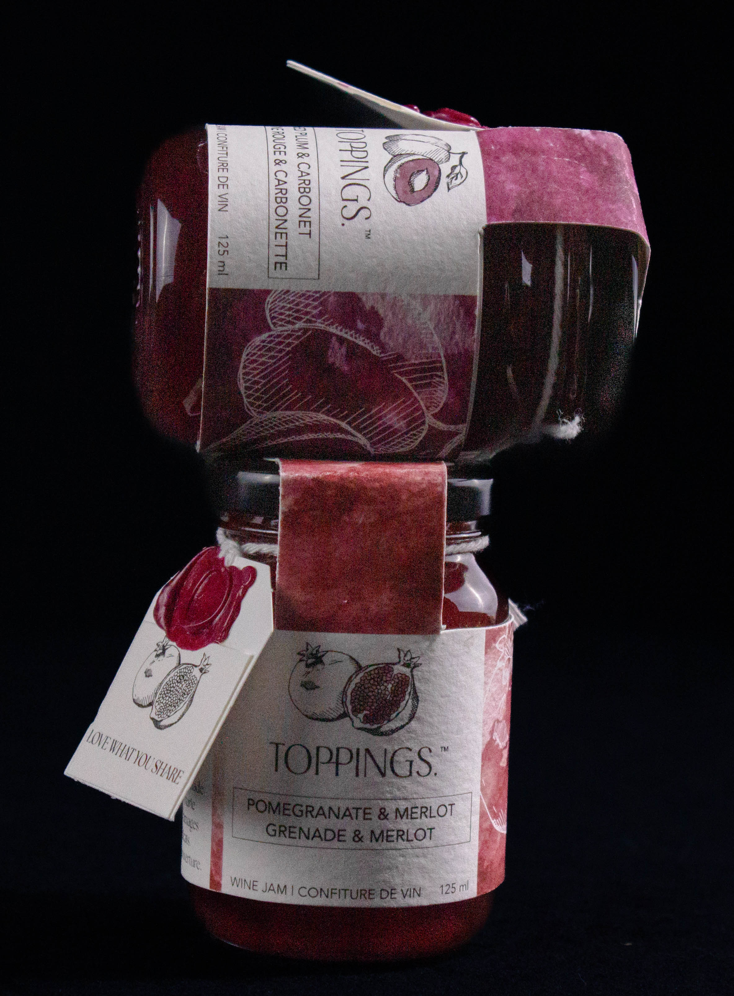
Toppings is a premium brand best known for its high quality charcuterie products, particularly its luxurious jams. Designed for a mature, discerning audience, Toppings positions itself as an upscale option available in curated retail environments like Indigo and Vincenzo’s.
When creating the logo, label, and packaging for Toppings Jam, my goal was to convey a sense of sophistication and artisanal quality. The logo is clean and bold, designed to strike a balance between refinement and visual impact.
The label design takes inspiration from traditional European painting techniques, particularly watercolour and oil. I used watercolour to reflect the wine infusion in the jam, creating a soft, fluid aesthetic; and selected a colour palette that visually represents the flavour profile of each variety. Hand drawn, crossed hatched fruit illustrations bring a personal, organic feel to the design. These details help differentiate the product from flatter, more commercial packaging styles.
To enhance the sense of craftsmanship, I incorporated a wax seal and a playful tag, elevating the unboxing experience and reinforcing the idea that this is a jam meant to be shared and savoured. The final touch is the romance copy on the label, guiding consumers with pairing suggestions that reflect the brand’s attention to detail and commitment to quality.
Toppings is a premium brand best known for its high quality charcuterie products, particularly its luxurious jams. Designed for a mature, discerning audience, Toppings positions itself as an upscale option available in curated retail environments like Indigo and Vincenzo’s. When creating the logo, label, and packaging for Toppings Jam, my goal was to convey a sense of sophistication and artisanal quality. The logo is clean and bold, designed to strike a balance between refinement and visual impact. It draws the eye while maintaining an understated elegance appropriate for a luxury product.
Design a gourmet jam brand from the ground up; including the product concept, logo, brand name, flavour, and full packaging system. The creative direction, aesthetic choices, and physical presentation were entirely open, giving full freedom to craft a unique, high end identity. This includes not only visual branding but also the conceptual rationale, material choices, and how the product would be positioned in a competitive, upscale market.
The label design takes inspiration from traditional European painting techniques, particularly watercolor and oil. I used watercolor to reflect the wine infusion in the jam—creating a soft, fluid aesthetic—and selected a color palette that visually represents the flavor profile of each variety. Hand-drawn fruit illustrations bring a personal, organic feel to the design, while cross-hatching adds texture and depth to evoke the richness of the jam itself. These details help differentiate the product from flatter, more commercial packaging styles.
To enhance the sense of craftsmanship, I incorporated a wax seal and a playful tag, elevating the unboxing experience and reinforcing the idea that this is a jam meant to be shared and savored. The final touch is the romance copy on the label, guiding consumers with pairing suggestions that reflect the brand’s attention to detail and commitment to quality.
Every design decision—from materials to illustration style—was made to express Toppings’ identity as a sophisticated, elevated brand that blends tradition, artistry, and taste.
Toppings Jam
Creative Process
Creative Process
Toppings Jam
Objective
Objective
Objective

Very first concept consisted of honey infused jam, marketed
as a healthy alternative to most jams to children

Second concepts experimented with a minimalist approach to a higher end charcuterie berry jam

Began refining the charcuterie concept, taking inspiration from designer brands to convey luxury

To the charcuterie concept, I added more colour. Began designing to achieve a more delicate appeal.

My final design focused on deepening the watercolour hues to place emphasis on the jams being infused with wine
Final label 1

Final label 2
Very first concept consisted of honey infused jam, marketed
as a healthy alternative to most jams to children
Second concepts experimented with a minimalist approach to a higher end charcuterie berry jam
Began refining the charcuterie concept, taking inspiration from designer brands to convey luxury
To the charcuterie concept, I added more colour. Began designing to achieve a more delicate appeal.
My final design focused on deepening the watercolour hues to place emphasis on the jams being infused with wine
Final label 1
Final label 2
Rationale
Rationale
Finished Piece
Rationale
Finished Piece


Final jam packaging

First concept was honey infused jam, marketed as a healthy alternative sugary jams for children
Began experimenting with minimalism and charcuterie
Began refining the charcuterie concept, aiming to convey luxury
Began adding more colour and designing to achieve a more delicate appeal
Deepening the watercolour hues to emphasize the jams being infused with wine
Final label 1
Final label 2

Both physically and digitally mocked up
click+hold to enlarge
Final cover design
click+hold to enlarge
Final cover design
click+hold to enlarge
Final design
Finished Piece