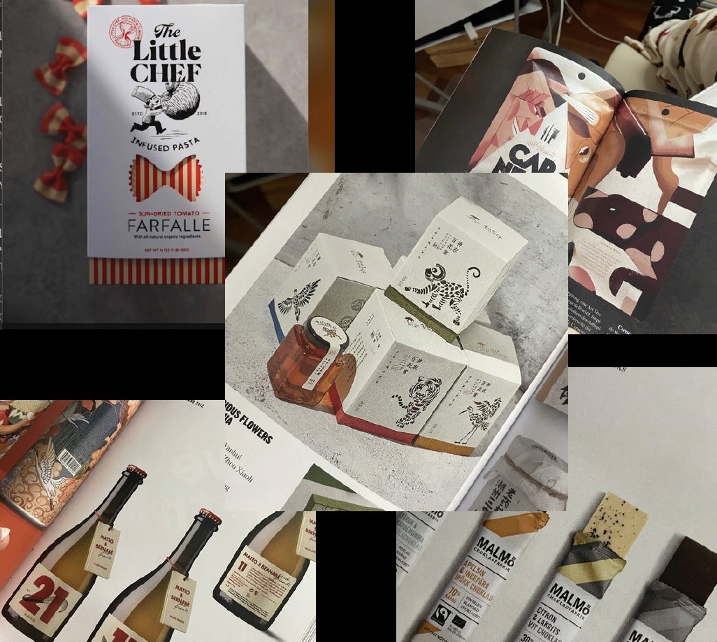
Project Collection
click+hold to enlarge
click+hold to enlarge
Design a packaging concept for Bio Life Organics, a brand known for its clean, health forward products. The assigned product category was “grains,” with the freedom to introduce a wildcard element. The task involved creating a compelling package that fits within the brand’s identity, deciding on a specific target audience, and making intentional design decisions around structure, visual language, and storytelling.
Design a packaging concept for Bio Life Organics, a brand known for its clean, health forward products. The assigned product category was “grains,” with the freedom to introduce a wildcard element. The task involved creating a compelling package that fits within the brand’s identity, deciding on a specific target audience, and making intentional design decisions around structure, visual language, and storytelling.
Final packaging
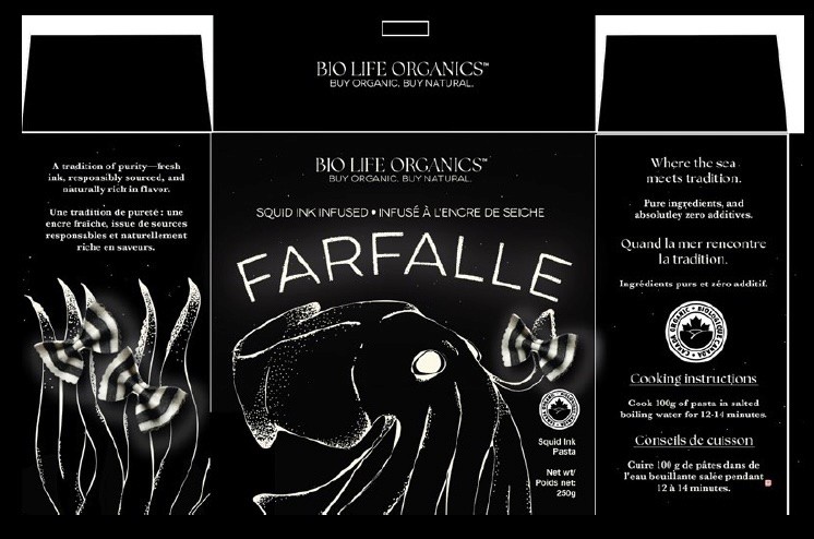
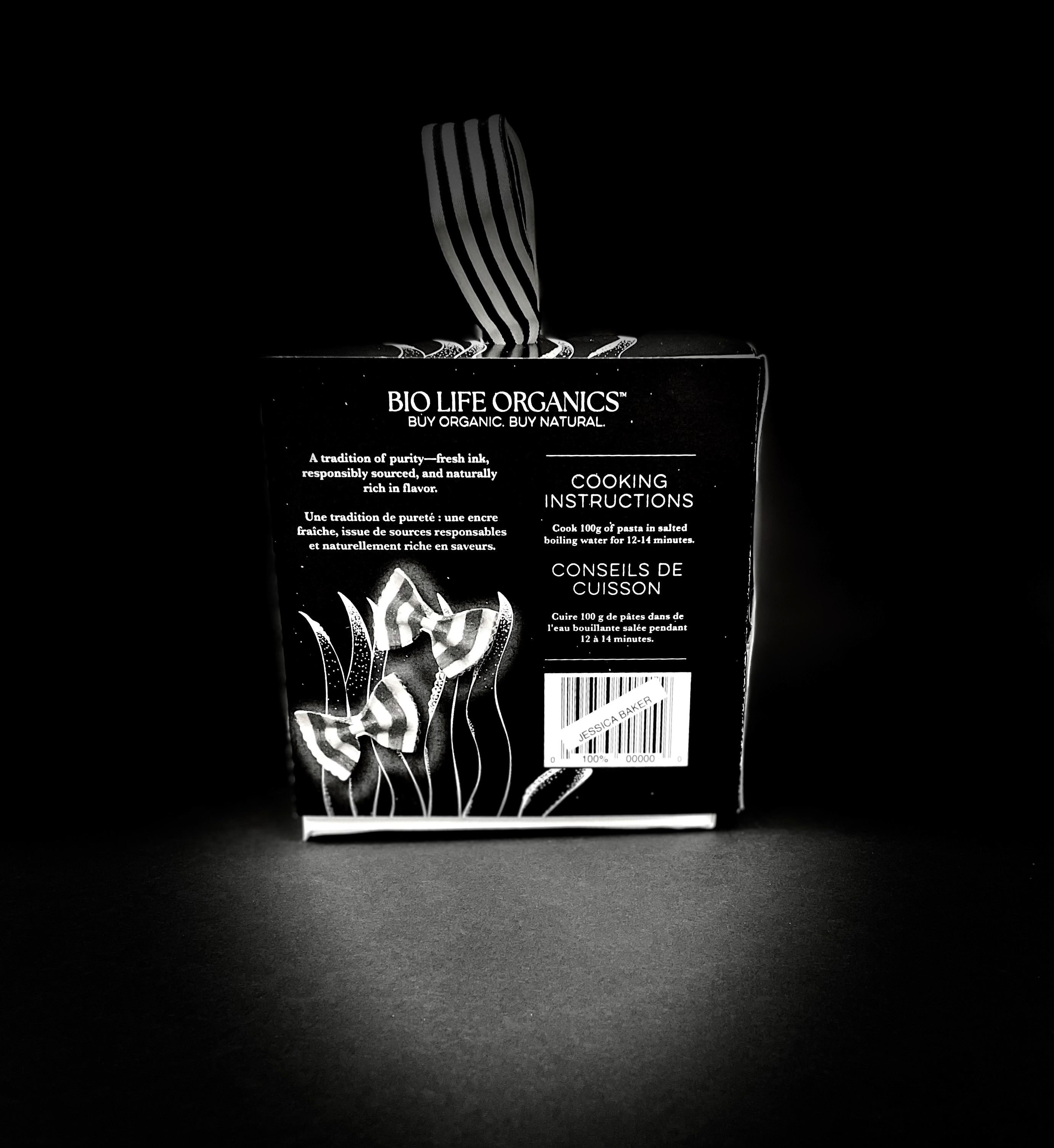
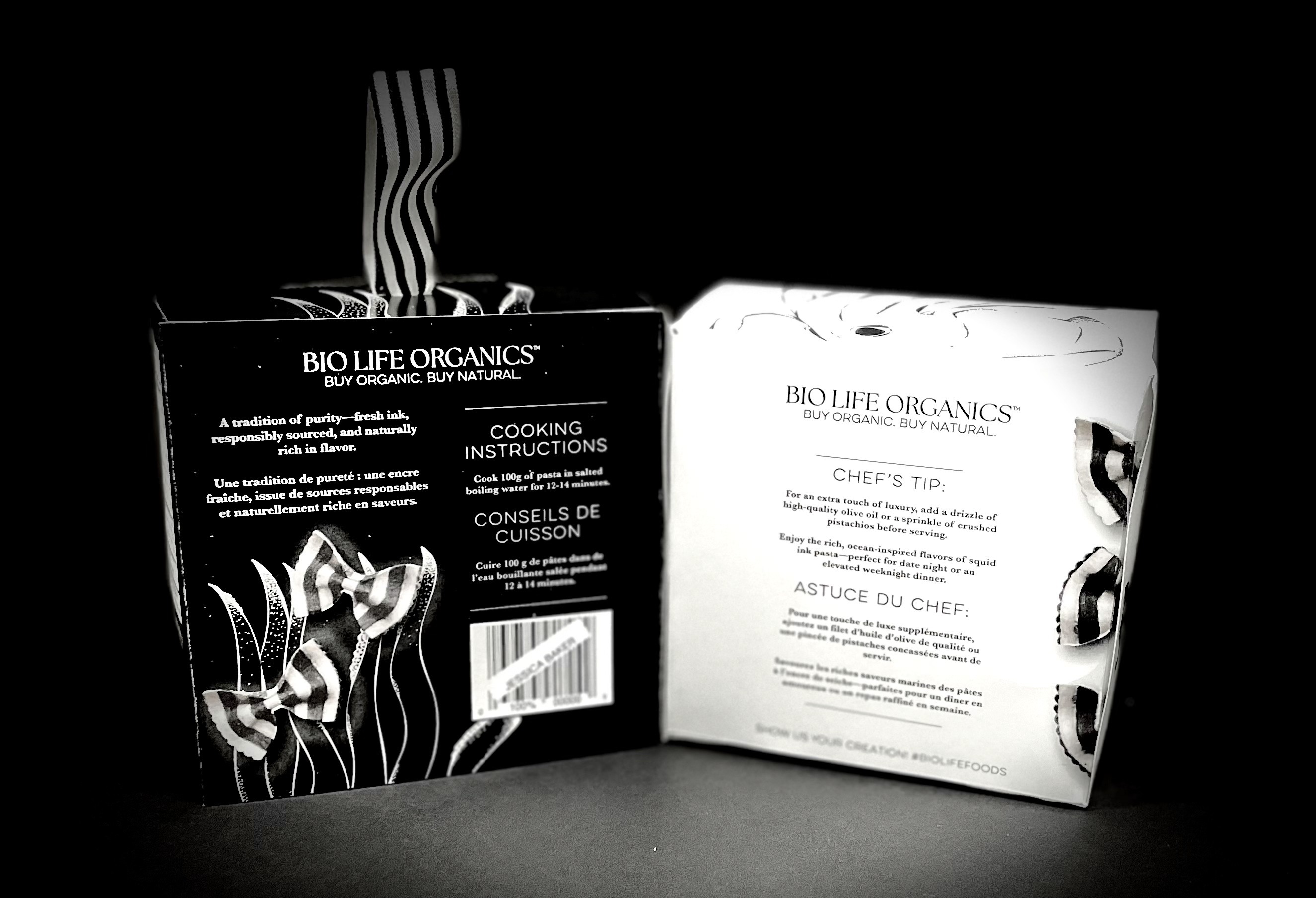
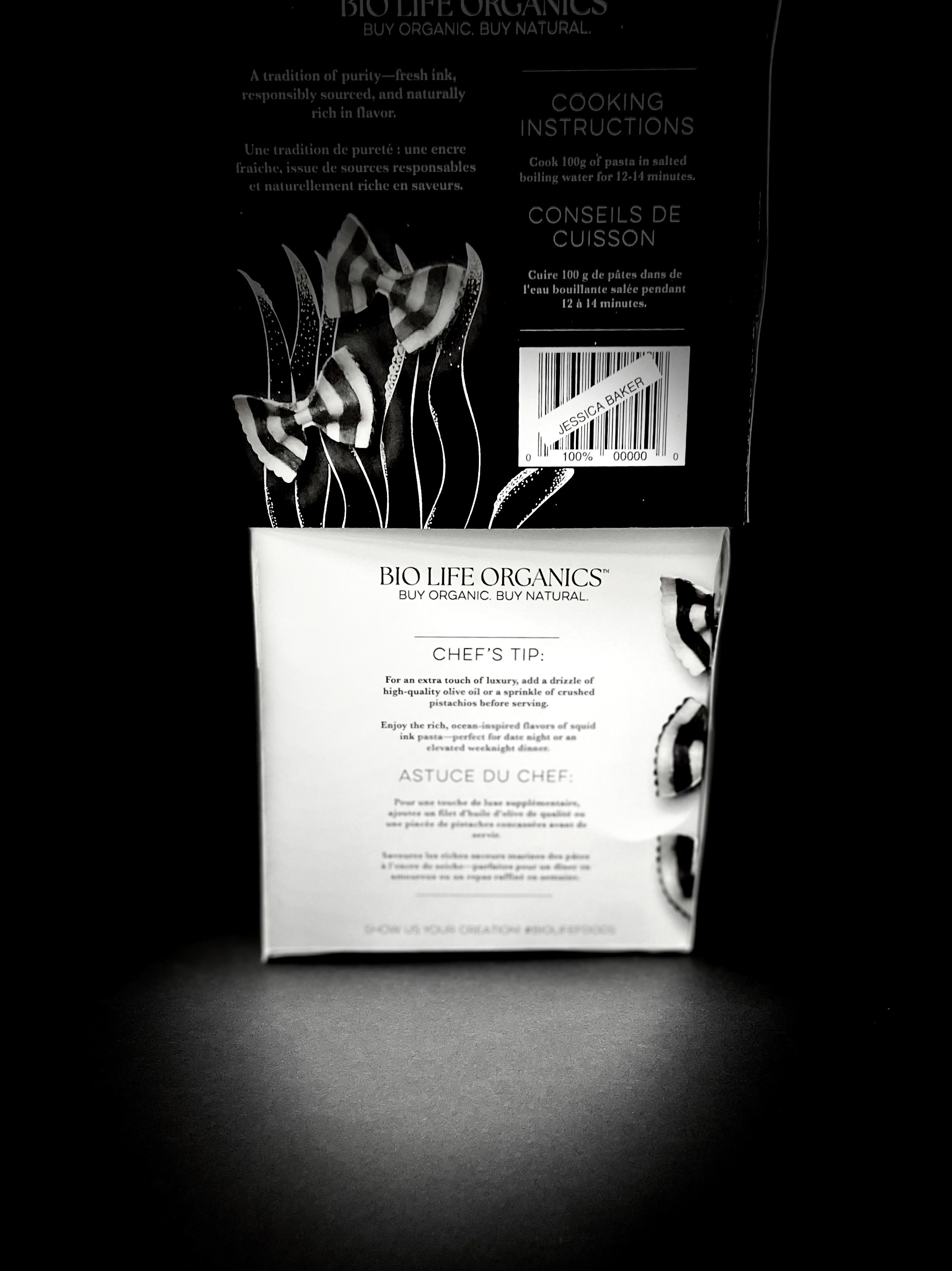
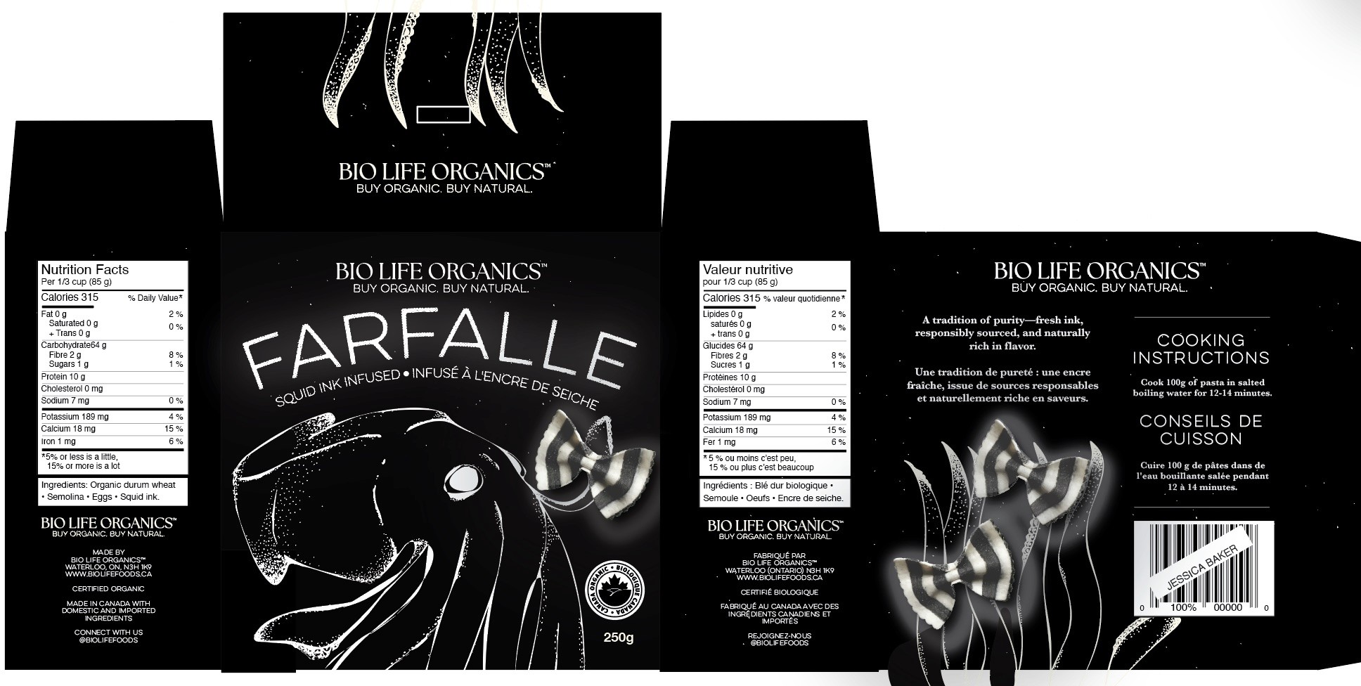
I designed premium packaging for Bio Life Organics’ squid ink farfalle; a distinctive product that allowed for exploration of both visual and conceptual boundaries. The design centres around a matte black box, chosen to reflect the deep colour of squid ink while establishing a strong, high-end shelf presence.
A hand-drawn, stylized squid wraps around the front of the box, holding a piece of farfalle in its tentacles. This illustration functions as both a visual anchor and a direct connection to the main ingredient. The use of hand drawn elements throughout the design brings an artisanal feel that complements the product’s organic roots, softening the bold aesthetic with a sense of craft and care.
To emphasize the uniqueness of the pasta, the farfalle is given a subtle glowing effect. This glow, echoed in the typography, helps draw attention to the product and creates a sense of delicacy and refinement. Tiny white and black specks scattered across the box represent deep sea bioluminescence.
While the overall look is clean and premium, care was taken to maintain the organic identity of the brand. The balance between the glowing, modern accents and the textured, hand rendered elements helps reinforce that this is a natural product with a strong sense of origin. A simple serif typeface is used for body copy to keep the tone grounded and readable.
The packaging copy reinforces the product’s heritage and values, describing the farfalle as a “tradition of purity; fresh ink, responsibly sourced, and naturally rich in flavour.” This positions the pasta not just as a specialty item, but as part of a larger story rooted in Italian culinary tradition and responsible food sourcing.
I designed premium packaging for Bio Life Organics’ squid ink farfalle—a distinctive product that allowed for exploration of both visual and conceptual boundaries. The design centers around a matte black box, chosen to reflect the deep color of squid ink while establishing a strong, high-end shelf presence.
A hand-drawn, stylized squid wraps around the front of the box, holding a piece of farfalle in its tentacles. This illustration functions as both a visual anchor and a direct connection to the main ingredient.
Design a packaging concept for Bio Life Organics, a brand known for its clean, health-forward products. The assigned product category was “grains,” with the freedom to introduce a wildcard element. The task involved creating a compelling package that fits within the brand’s identity, deciding on a specific target audience, and making intentional design decisions around structure, visual language, and storytelling.
For this project, I created a packaging concept for Squid Ink Farfalle—a bold, elevated take on pasta that caters to adventurous food lovers who value both quality ingredients and sophisticated presentation. The challenge was to align the premium, gourmet nature of the product with Bio Life Organics’ reputation for simplicity, transparency, and organic sourcing.
The use of hand-drawn elements throughout the design brings an artisanal feel that complements the product’s organic roots, softening the bold aesthetic with a sense of craft and care.
To emphasize the uniqueness of the pasta, the farfalle is given a subtle glowing effect. This glow, echoed in the typography, helps draw attention to the product and creates a sense of delicacy and refinement. Tiny white and black specks scattered across the box represent deep-sea bioluminescence—tying the visual language back to the squid’s natural environment.
While the overall look is clean and premium, care was taken to maintain the organic identity of the brand. The balance between the glowing, modern accents and the textured, hand-rendered elements helps reinforce that this is a natural product with a strong sense of origin. A simple serif typeface is used for body copy to keep the tone grounded and readable.
The packaging copy reinforces the product’s heritage and values, describing the farfalle as a “tradition of purity—fresh ink, responsibly sourced, and naturally rich in flavor.” This positions the pasta not just as a specialty item, but as part of a larger story rooted in Mediterranean culinary tradition and responsible food sourcing.
Overall, the packaging aims to highlight the contrast that defines the product itself—striking yet simple, elevated yet honest.
Squid Ink Farfalle Packaging
Squid Ink Farfalle
Packaging
Creative Process
Creative Process
Squid Ink Pasta Packaging
Objective
Objective
Objective
Research + inspiration

Rough sketch of chosen concept

My original noodle photo

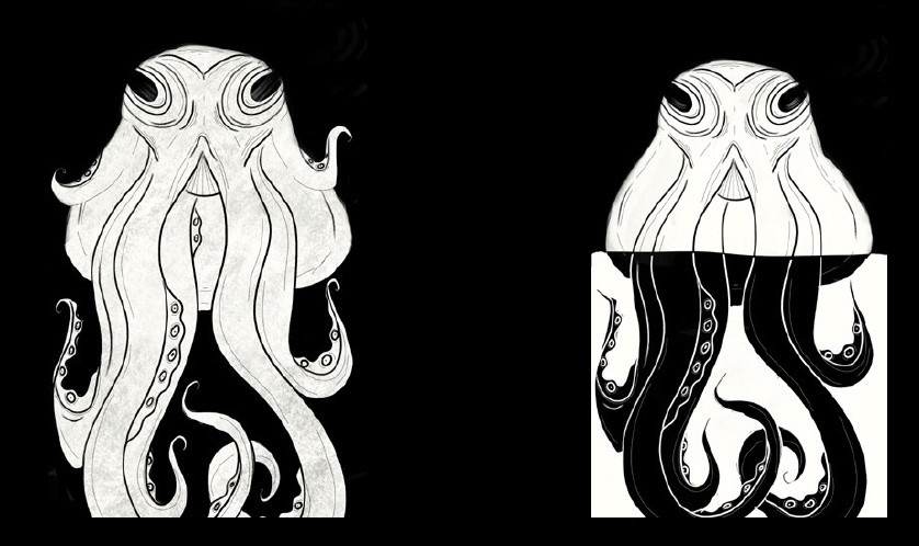
First iterations of the squid, played with inverting colours
Began navigating how to separate the body from head
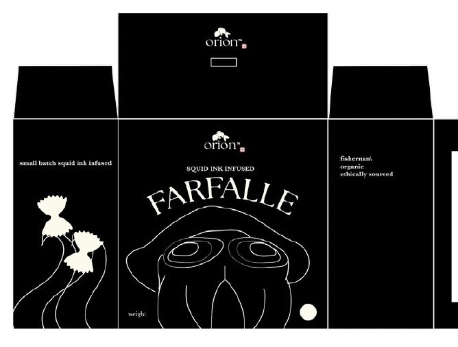
Dieline + placeholder images and text. General layout

Inserted packaging art

Alternative concept

Final stages of my first concept. Looked like evil octopus
Nearly final iteration; looks more friendly and squid like
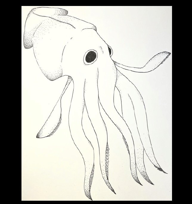
Original ink drawing of squid

Vectorized image, changed pose
Research + inspiration
Rough sketch of chosen concept
My original noodle photo
First iterations of the squid, played with inverting colours
Began navigating how to separate the body from head
Dieline + placeholder images and text. General layout
Inserted packaging art
Alternative concept
Final stages of my first concept. Looked like evil octopus
Nearly final iteration; looks more friendly and squid like
Original ink drawing of squid
Vectorized image, changed pose
Rationale
Rationale
Finished Piece
Rationale
Finished Piece
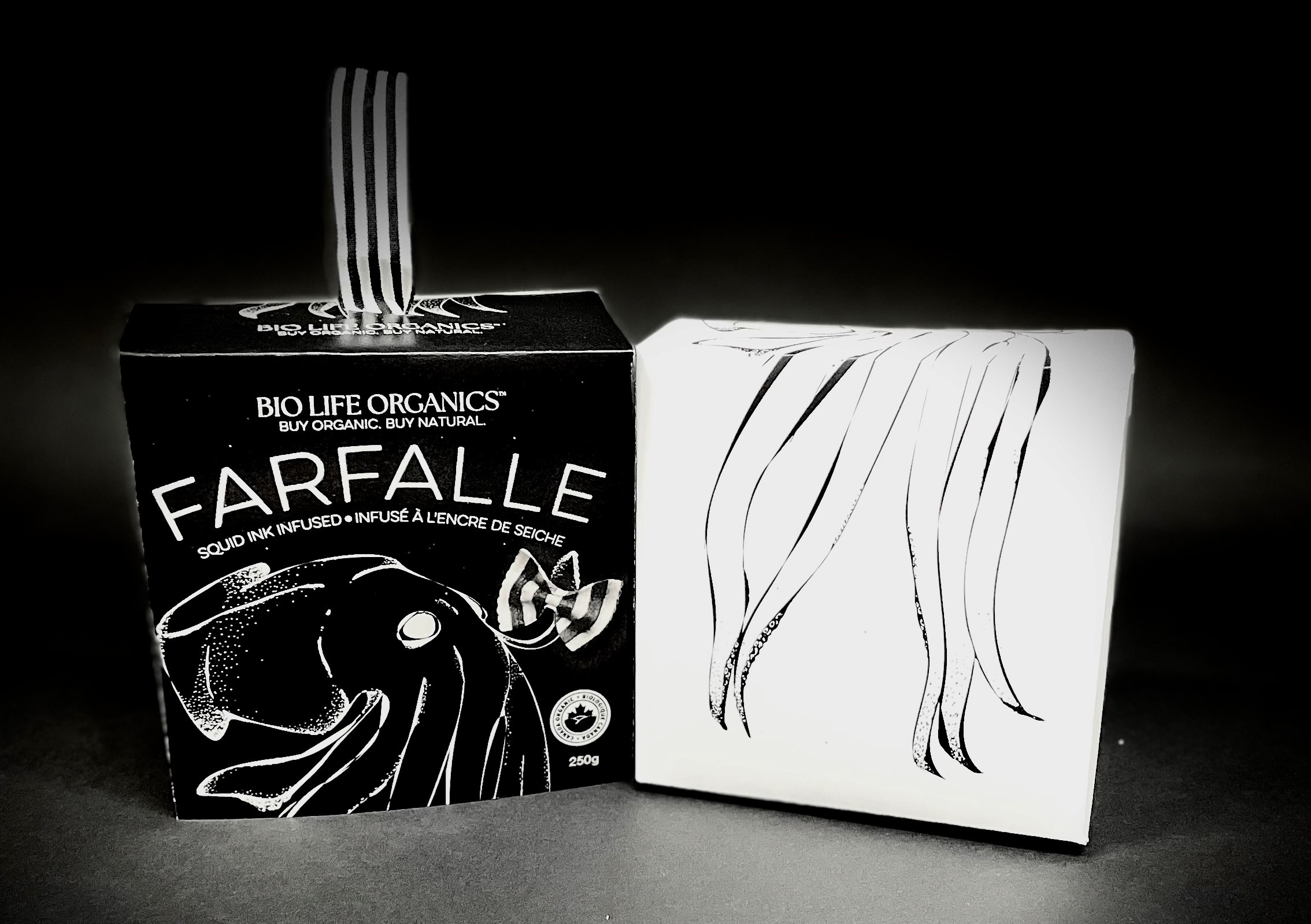


Final packaging
Physical mockups
Digital dielines


Physical mockups
Digital dielines
Research + inspiratioin
Rough sketch of chosen concept
My original noodle photo
First iterations of the squid, played with inverting colours
Navigating how to separate body from head
Dieline + placeholder images and text
Alternative concept
Final stages of first concept. Looked like
evil octopus
Nearly final iteration, looks more
friendly and squid like
Original ink squid drawing
Vectorized drawing + position tweaks
click+hold to enlarge